A Plane Radar on the Desk: The Display Was Never the Problem
There is a round, 480-pixel display on my kitchen counter showing every aircraft within 100 km, updated live. It’s a LilyGo T-RGB — an ESP32-S3 with a 2.1-inch circular LCD — pulling ADS-B positions over Wi-Fi and drawing them as a sweep-less radar. The hardware was the easy part. It powered up, rendered a clean grid, labelled the compass, and showed exactly zero aircraft over one of the busiest patches of sky in Texas.
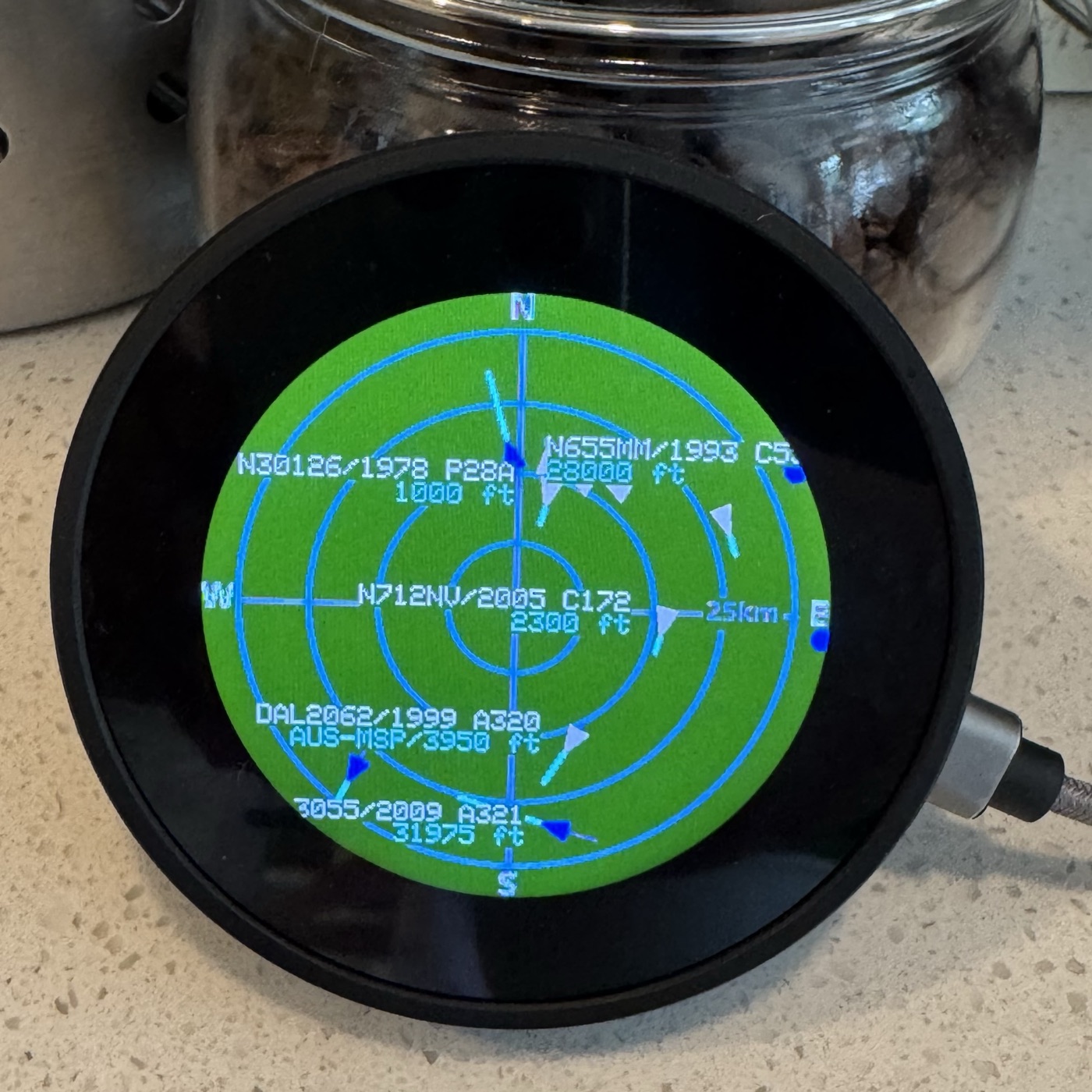
The display was never the problem
That’s the whole story of this build, compressed. Getting an RGB panel lit and a radar drawn took an afternoon. Every bug that actually cost time after that lived in the data — in what the device asked for, what it got back, and how honestly it drew the answer. The screen was telling the truth the entire time. The truth was just wrong.
It’s worth saying plainly because the instinct when a screen is blank is to suspect the screen. Here the discipline that paid off was the opposite: assume the renderer is fine and walk the data backwards until something stops making sense.
A blank radar and a single sign
The serial log made the first bug findable in one line. Every three seconds the firmware printed adsb: 0 aircraft — no HTTP error, no parse error, no empty response. The request succeeded, the JSON parsed, the aircraft array came back. It just had nothing in it.
So the network was fine and the parser was fine. That leaves one input: where it was looking. The device builds its query from a stored latitude and longitude, and the longitude it was sending had the wrong sign. West longitudes are negative; the stored value had lost its minus. Flipping a West longitude positive doesn’t nudge the query — it reflects it across the prime meridian into the opposite hemisphere, here an empty stretch of western China. The API was doing its job perfectly — returning every aircraft near a point with no traffic, which is none.
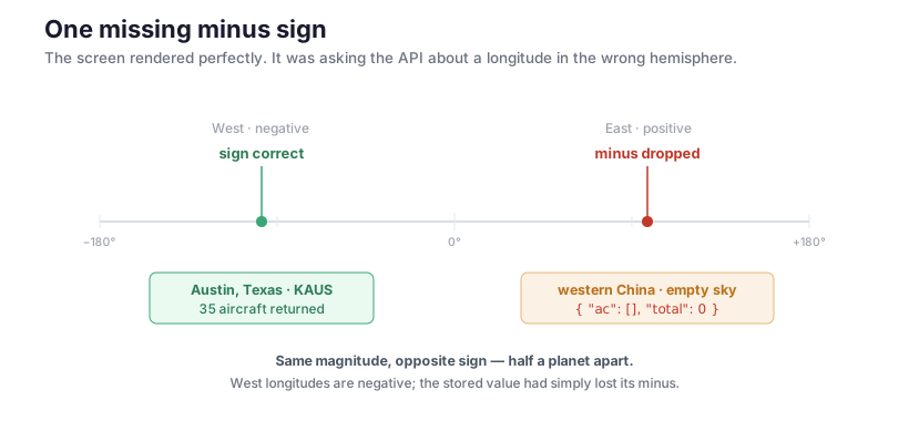
Restore the sign and the same request returns 35 aircraft. The fix was one character. Finding it was a matter of refusing to touch the display code — the layer that looked broken — and instead reading the one log line that said the fetch had already succeeded.
There was a second, quieter version of the same mistake waiting in the projection. The code converted both latitude and longitude to kilometres with the same constant, 111 km per degree. That’s right for latitude everywhere, but a degree of longitude shrinks with the cosine of your latitude — at 30°N it’s only about 96 km. Left alone, every plane was pushed too far east or west and drifted toward the rim. Same shape of bug: the data was there, and the code quietly lied about where it went.
Routes that are confidently wrong
With aircraft on the screen, the next want was obvious — where is each one going? The ADS-B feed doesn’t carry that; it has position, altitude, speed, type, and a callsign. To turn SWA454 into “Austin to St. Louis” you need a second lookup against a route database.
This is where the data stopped being merely absent and started being wrong with confidence. Free route databases are keyed by flight number, not by the aircraft in the sky, and flight numbers get recycled and the records rot. I checked three for SWA454, whose real route that day was AUS–STL:
| Source | Answer | |
|---|---|---|
| adsbdb | SJC–SAN | today’s best free source |
| hexdb.io | KBUF–MCO | record last touched in 2018 |
| adsb.lol | (empty) | position-aware, returned nothing |
Three databases, three answers, none of them right. A paid schedule API would fix it; nothing free will. So the question became editorial, not technical: what do you show when every source you have is unreliable?
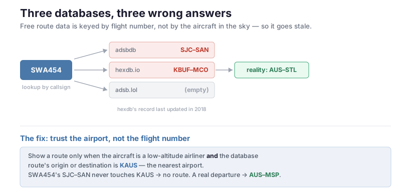
The answer came from the radar’s own bias. This display sits next to KAUS — Austin’s airport — and the planes low over it are overwhelmingly its own arrivals and departures. So a route only earns the screen when two things hold: the aircraft is a low-altitude airliner (an airline-style callsign, below 20,000 ft), and the database route’s origin or destination is the nearest airport. SWA454’s bogus SJC–SAN never touches KAUS, so it draws no route at all. A genuine Austin departure resolves to AUS–MSP — visible on a low Delta A320 in the photo above — and that one you can trust, because it agrees with what the geometry already told you. Better to show nothing than to show a confident lie.
Making it feel alive
The feed updates every three seconds — that’s the public rate limit, and there’s no arguing with it. Drawn naively, aircraft teleport: hold still for three seconds, jump, hold, jump. The screen felt like a slideshow.
The fix is dead reckoning. Each aircraft reports a ground speed and a track; between network fixes, the firmware advances every plane along its heading and repaints at 10 frames a second. The network never gets faster — it just stops being the thing you watch.
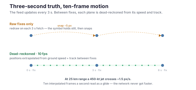
What makes this cheap is how little a plane actually moves on screen. At the 25 km range, a 450-knot jet crosses about 1.5 pixels per second. Ten interpolated frames a second is wildly more than enough to read as continuous, and the per-frame cost stays small: the static grid is rendered once and cached, so each repaint is a memory blit plus the moving symbols plus the panel push — roughly 50 ms, comfortably inside the 100 ms budget. The trails still record only the real fixes, so history stays honest while the live symbol glides.
Legibility is data too
The last round of work was about reading the thing across a room, which is also a data problem — just about density rather than truth. The aircraft feed already carries a year field, so the type label became 2015 B738 instead of bare B738, free of charge. The tag collapsed from four stacked lines to two slash-separated ones — SWA454/2015 B738 over AUS-STL/37000 ft — and the font doubled. Bigger labels collide, so a declutter pass gives nearest aircraft priority and suppresses any tag whose box would overlap one already drawn. The symbol always shows; only the text yields. Real radar displays have done exactly this for decades.
A desk ADS-B radar turns out to be a machine for displaying data you don’t own. The panel and the geometry are a weekend; the long tail is everything the data does to you afterward — a sign that flips a hemisphere, a route that’s three years stale, a feed too slow to look alive. Each fix was less about the ESP32 than about a decision: where the plane really is, whether the route is trustworthy enough to print, how to fake smoothness the network won’t give you. The screen was honest from the first afternoon. The work was making the data deserve it.